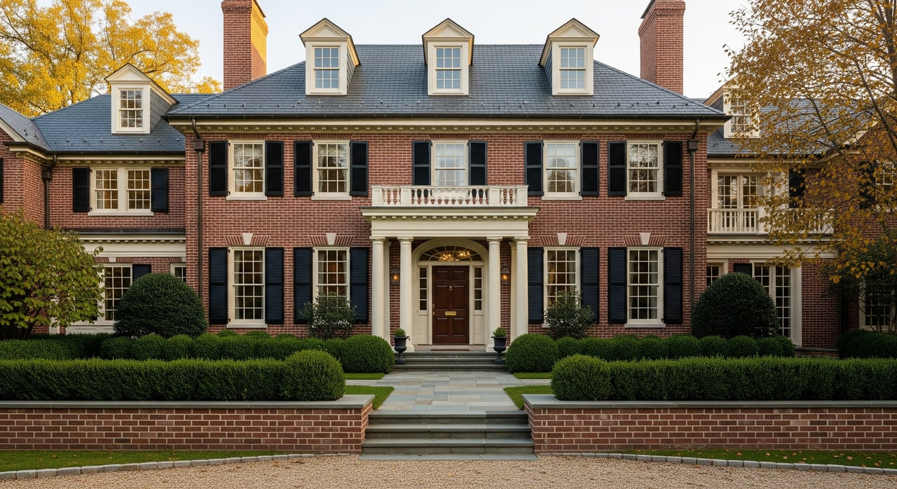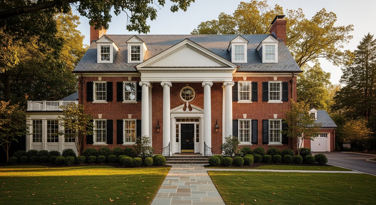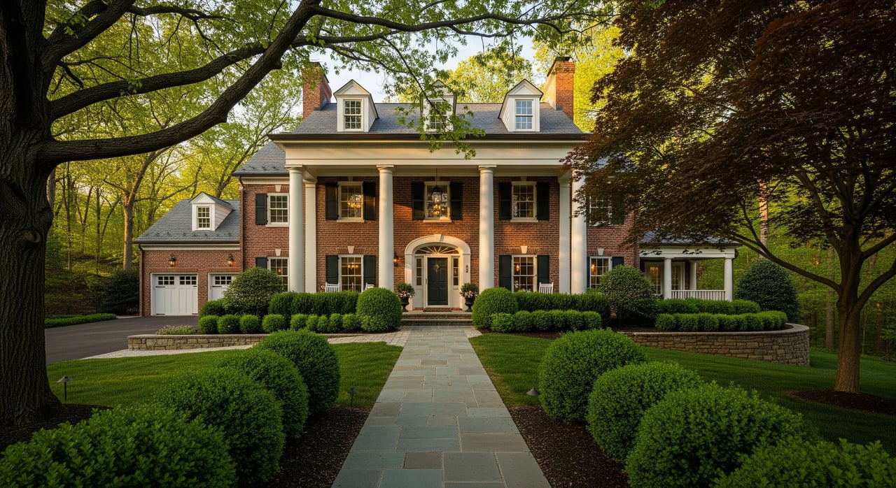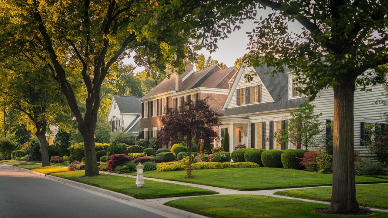
Choosing the right paint tones for every room in your home is both an art and a science. The colors you select can significantly influence the mood, perception of space, and overall aesthetic of your living environment. Understanding the science of color can help you make informed decisions that reflect your personal style while enhancing the functionality of each room. By exploring various aspects of color theory, lighting, and psychological effects, you can create harmonious and visually appealing spaces.
Understanding Color Theory
Color theory is the foundation for selecting paint tones. It involves understanding the color wheel, which is composed of primary, secondary, and tertiary colors. Primary colors—red, blue, and yellow—are the building blocks of all other colors. Secondary colors, such as green, orange, and purple, are created by mixing primary colors. Tertiary colors result from mixing primary and secondary colors. Familiarity with the color wheel helps in creating color schemes, such as complementary, analogous, and triadic, which can guide your paint choices.
Complementary colors, located opposite each other on the color wheel, create vibrant contrasts, making them ideal for accent walls or focal points. Analogous colors, found next to each other, offer a more harmonious and serene look, suitable for creating a cohesive flow between rooms. Triadic color schemes, which involve three evenly spaced colors on the wheel, provide a balanced and dynamic palette.
The Role of Lighting
Lighting plays a crucial role in how paint colors appear in a room. Natural and artificial lighting can alter the perception of color, making it essential to consider the light sources in each space. North-facing rooms tend to have cooler, softer light, which can make colors appear more muted. In contrast, south-facing rooms receive warm, intense light, enhancing the vibrancy of colors.
When selecting paint tones, test samples on your walls and observe them at different times of the day. This practice helps you understand how the colors will look under varying lighting conditions. Additionally, consider the type of artificial lighting in the room. Incandescent bulbs emit a warm glow, while fluorescent lights produce a cooler, bluish tone. LED lights offer a range of color temperatures, allowing for more flexibility in achieving the desired ambiance.
Psychological Impact of Colors
Colors have psychological effects that can influence mood and behavior. Understanding these effects can guide your paint choices to create the desired atmosphere in each room. For instance, blue is known for its calming and soothing properties, making it an excellent choice for bedrooms and bathrooms. Green, associated with nature and tranquility, works well in living rooms and home offices.
Warm colors like red, orange, and yellow are energizing and can stimulate conversation and appetite, making them suitable for dining rooms and kitchens. However, these colors can be overwhelming if used excessively, so consider using them as accents or in moderation. Neutral colors, such as beige, gray, and white, provide a versatile backdrop that can complement any decor style and are ideal for creating a sense of balance and sophistication.
Creating a Cohesive Color Palette
A cohesive color palette ensures a harmonious flow throughout your home. Start by selecting a base color that will serve as the foundation for your palette. This color should be versatile and adaptable to different rooms. Once you have your base color, choose complementary or analogous colors to create a unified look.
Consider the function and mood of each room when selecting additional colors. For example, a soft pastel palette can create a serene and relaxing environment, while bold, contrasting colors can add energy and excitement. Use accent colors to highlight architectural features or add visual interest to a space.
Considering Room Size and Function
The size and function of a room can influence your paint choices. Light colors, such as whites and pastels, can make small rooms appear larger and more open. In contrast, dark colors can add depth and coziness to larger spaces. When selecting colors, consider the room's purpose and how you want it to feel.
For example, a home office may benefit from calming blues or greens to promote focus and productivity, while a playroom could be painted in vibrant, cheerful colors to encourage creativity and playfulness. In multifunctional spaces, such as open-plan living areas, use color to define different zones and create a sense of structure.
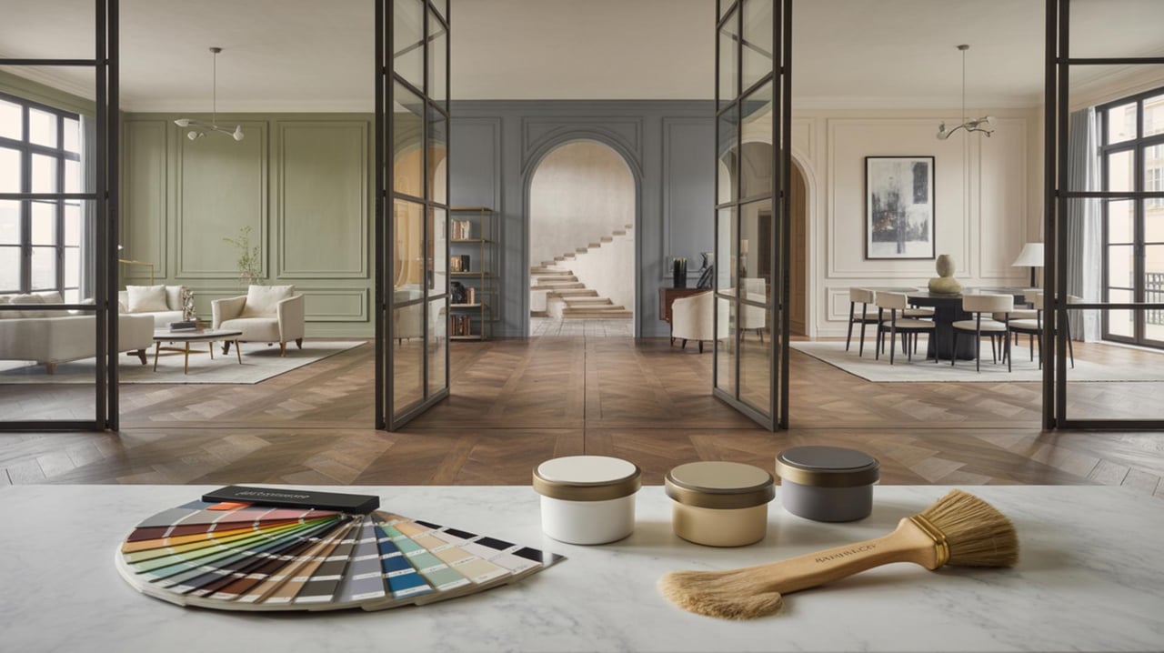
Testing Paint Samples
Before committing to a paint color, it's essential to test samples on your walls. Paint a small section of the wall with your chosen colors and observe how they look at different times of the day. This step allows you to see how the colors interact with the room's lighting and other elements, such as furniture and flooring.
Testing samples also helps you identify any unexpected undertones that may not be apparent in a paint chip. Undertones can affect how a color appears in your space, so it's important to choose colors that complement the existing elements in the room.
Balancing Bold and Neutral Tones
Balancing bold and neutral tones can create a dynamic and visually appealing space. Bold colors can add personality and drama to a room, while neutral tones provide a calming and grounding effect. When using bold colors, consider pairing them with neutrals to create contrast and prevent the space from feeling overwhelming.
For instance, a bold accent wall in a deep blue or rich burgundy can be balanced with neutral furnishings and decor. Alternatively, use bold colors in smaller doses, such as through accessories, artwork, or textiles, to add pops of color without overpowering the space.
Incorporating Trends Wisely
While it's tempting to follow the latest color trends, it's important to incorporate them wisely to ensure your space remains timeless and functional. Trends can provide inspiration and introduce new color combinations, but they should be balanced with classic elements to avoid a dated look.
Consider using trendy colors in easily changeable elements, such as accent walls, decor, or textiles. This approach allows you to update your space without committing to a complete overhaul. When selecting paint colors, prioritize those that reflect your personal style and complement the overall design of your home.
Using Color to Highlight Architectural Features
Color can be a powerful tool for highlighting architectural features and creating focal points in a room. Use contrasting colors to draw attention to elements such as moldings, fireplaces, or built-in shelving. For example, painting a fireplace in a bold color can make it a striking centerpiece in a living room.
Alternatively, use color to enhance architectural details, such as painting moldings or trim in a complementary shade to the walls. This technique adds depth and dimension to a space, creating a polished and cohesive look.
Seeking Professional Advice
If you're unsure about selecting paint tones or creating a cohesive color palette, consider seeking professional advice. Interior designers and color consultants can provide valuable insights and recommendations based on your preferences and the unique characteristics of your home. They can help you navigate the complexities of color theory, lighting, and design to achieve the desired outcome for your space.
Transform Your Home with the Right Colors
Choosing the right paint colors can truly transform your home, making each room feel just right. By understanding the science of color, you can create spaces that are both beautiful and functional. Whether you're looking to make a room feel larger or cozier, the right color can make all the difference. If you're ready to explore more ways to enhance your home, contact the Carrie & Co Real Estate Group for expert advice and personalized service.